Grids
The educational project about grids which Obys uses every day with unusual storytelling — rebuilt by Emiro.
This edition of Grids was rebuilt from scratch by Emiro.
Concept and design: an Obys Agency educational project.
Are
4 types of grids
G
r
i
D
S
Loading...
00
20
70
100
j
U
S
T
Columns
tools
... but these tools are...
Van De Graaf
P
O
W
E
R
F
U
L
are
G

T

P
W
R
U

Intro /
Grids /
Books
Emiro ©2026
Grids


Grid:
Crazy Mode:
Rectangular
Others
/ Emiro
4 types of grids
4 types of grids
F




Others
04
Rectangular
03
Van De Graaf
02
Columns
01
Others
04
Rectangular
03
Van De Graaf
02

Columns
01
Intro /
Grids /
Books
Emiro ©2026
Grids
Grid:
Crazy Mode:
Intro /
Grids /
Books
Obys Agency ©2021
Grids
Grid:
Crazy Mode:
Scroll down¬
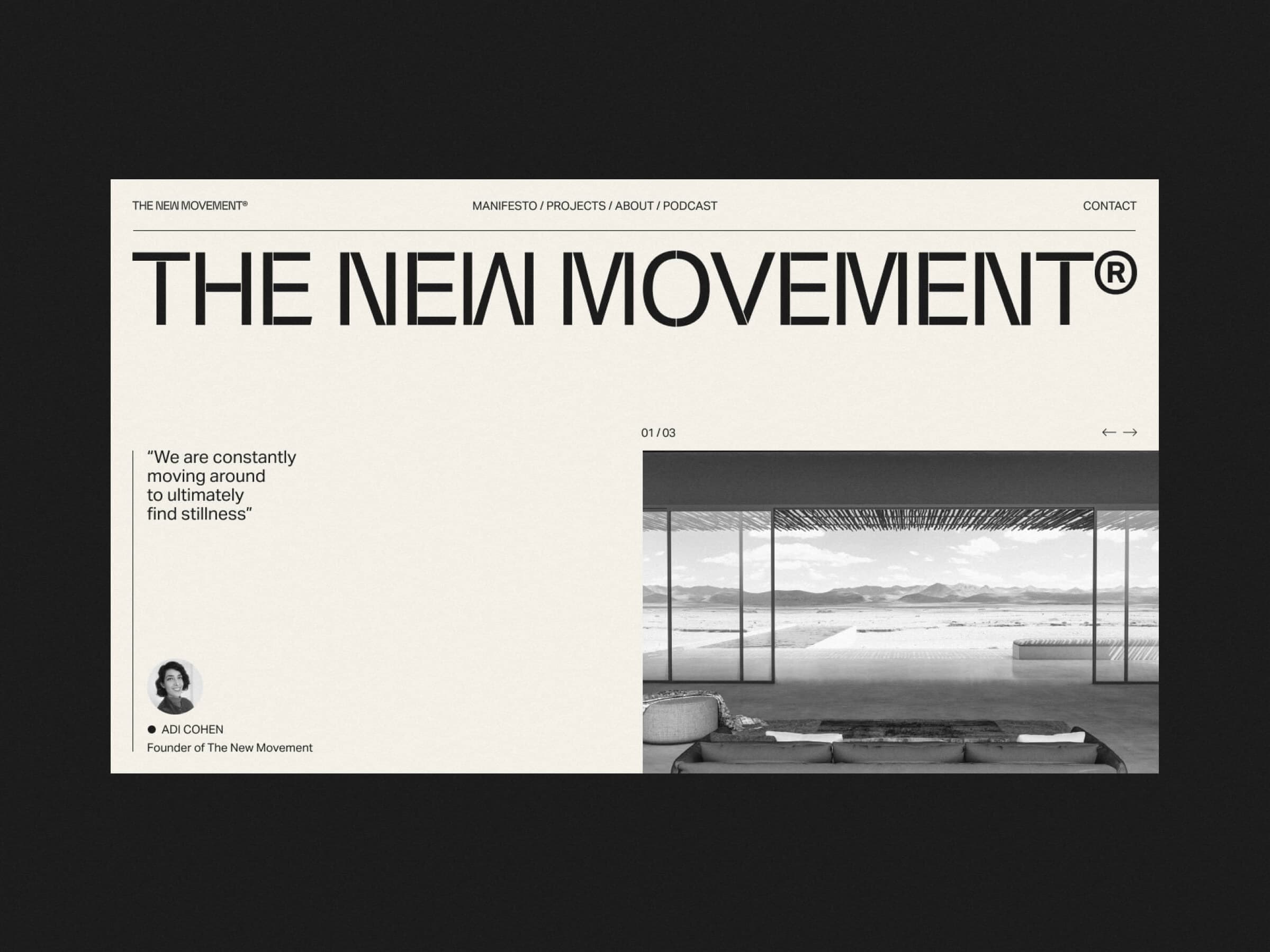
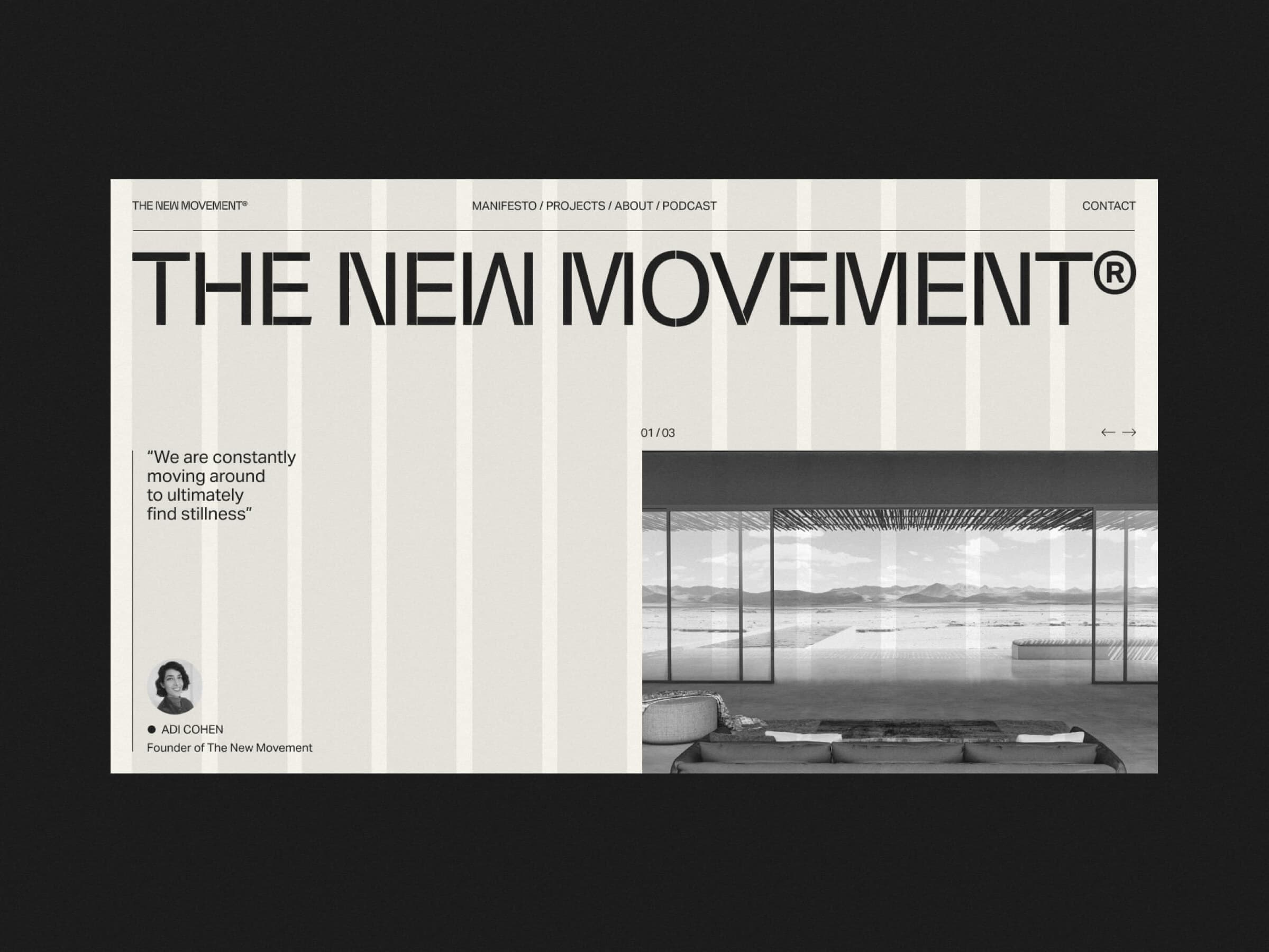
The New Movement Obys Agency — 2020
(01)
Grid
12 Columns
Margins
30 px
Gutters
20 px
Paddings System
Used
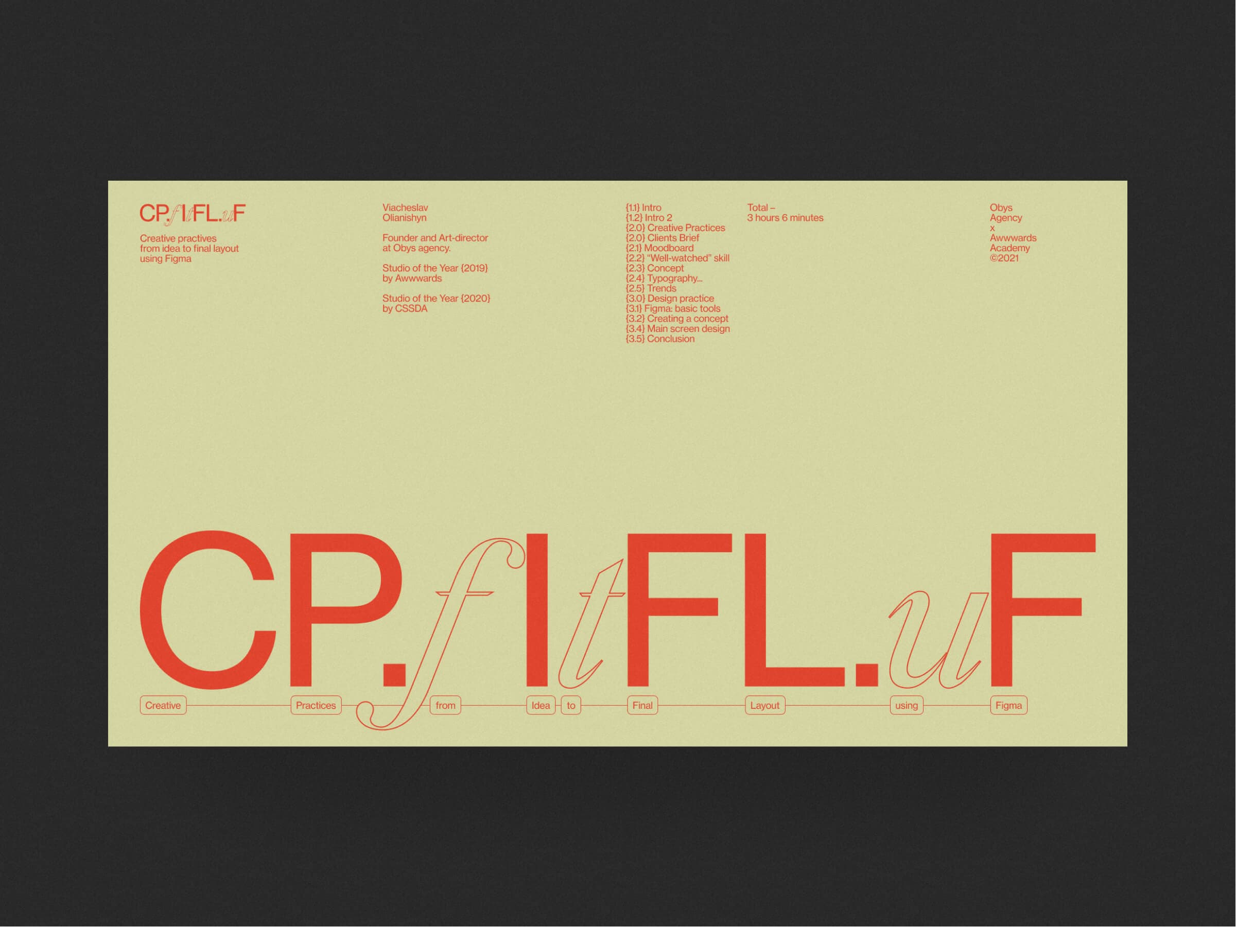
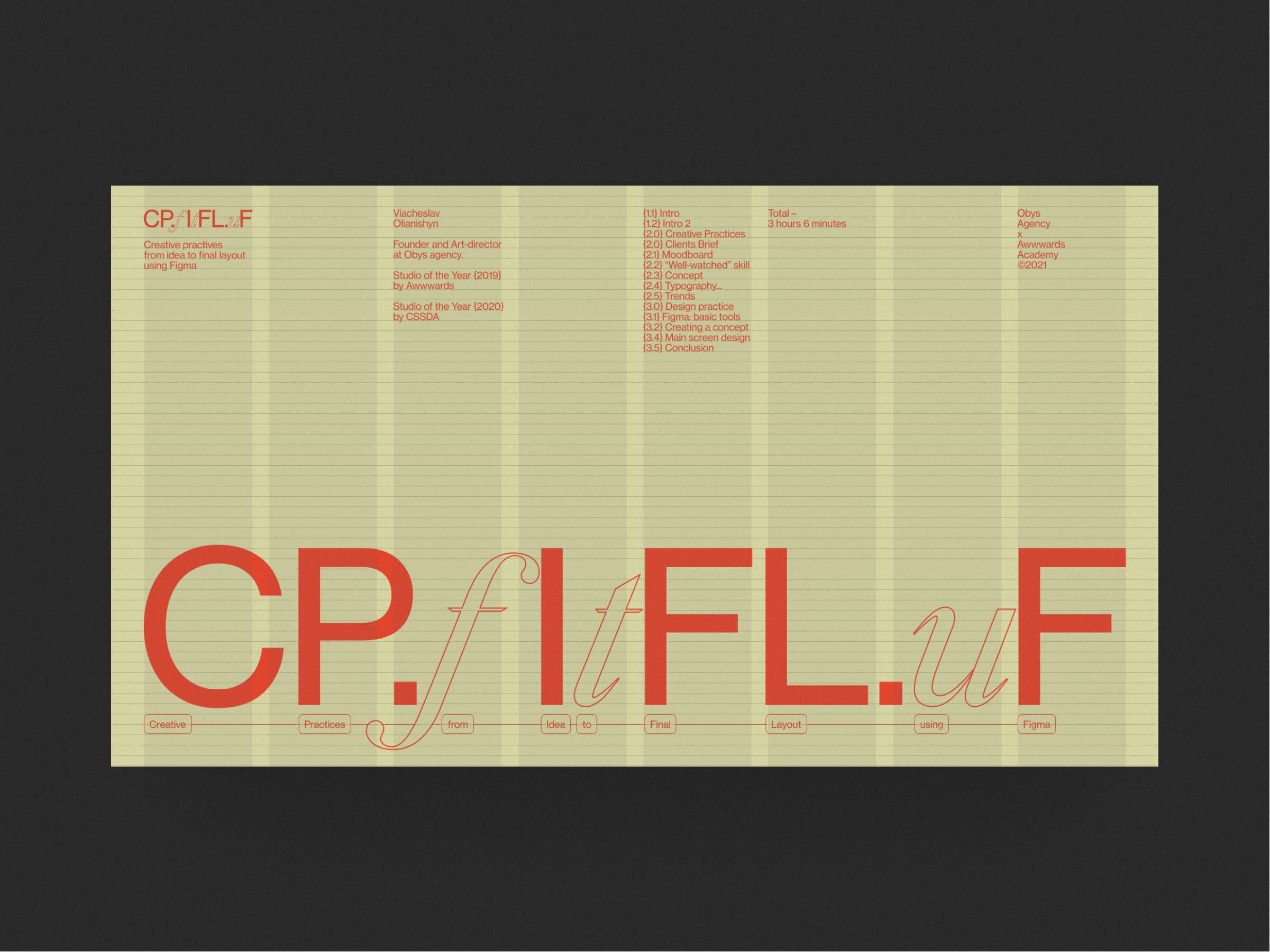
CP.fItFL.uF Obys Agency — 2020
(02)
Grid
8 Columns
Margins
60 px
Gutters
30 px
Horizontal Grid
Used
B—M—A Obys Agency — 2020
(03)
Grid
10 Columns
Margins
80 px
Gutters
20 px
Paddings System
Used
Scroll down¬
Intro /
Grids /
Books
Obys Agency ©2021
Grids
Grid:
Crazy Mode:
Intro /
Grids /
Books
Obys Agency ©2021
Grids
Grid:
Crazy Mode:
Intro /
Grids /
Books
Obys Agency ©2021
Grids
Grid:
Crazy Mode:


/ Emiro

don't be afraid
to break
the rules
(if it's worth that)
GRIDS Obys Agency — 2021
Don't be afraid
to break
the rules
(if it's worth that)
GRIDS Obys Agency — 2021









columns
01
This type of grid is used most of all at Obys agency. We try to combine this one with the paddings system or
to use it with the typographic grid based on the line height.
(About grid)
Grid
1920 x 1080
Advices and notes
(Step 1)
Set Margins
From left and right side of the screen
(Step 2)
Set Gutters
Space between the columns
(Notes)
(1)You can use a grid without gutters and margins too. (2)You can split the columns, thus making the grid more detailed. For example, make 16 column grid from 8. (3)This grid can be adapted to different screens easily.
Grid
1920 x 1080

Grid
1920 x 1080

(Notes)
(1)Use a horizontal grid based on line height. (2)Determine the size of the text style (usually 14-16px), adjust the appropriate line height. It will be your base for the horizontal grid. (3)Choose the font size for other typography fitting on it.


L



van de graaf
02
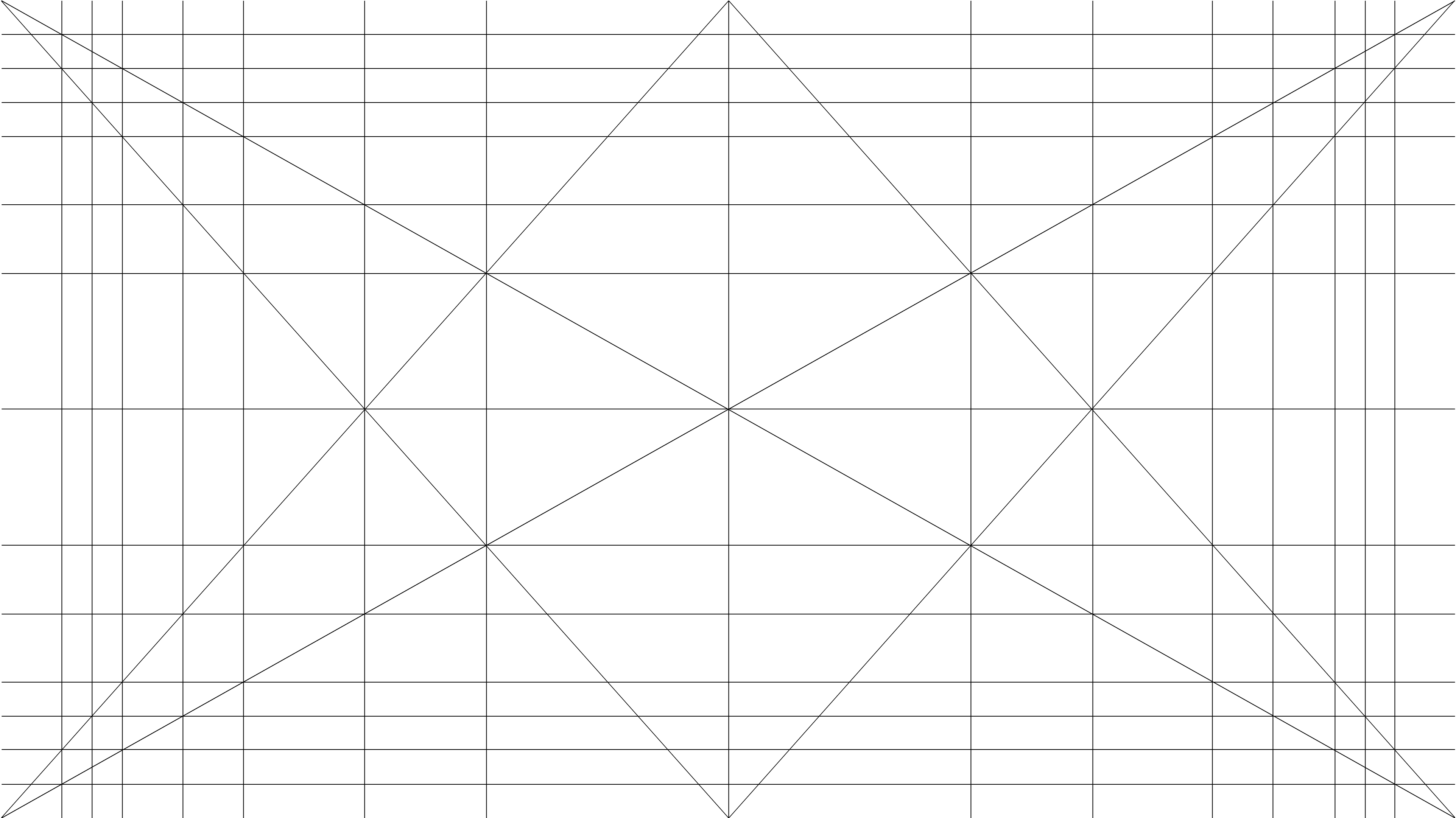
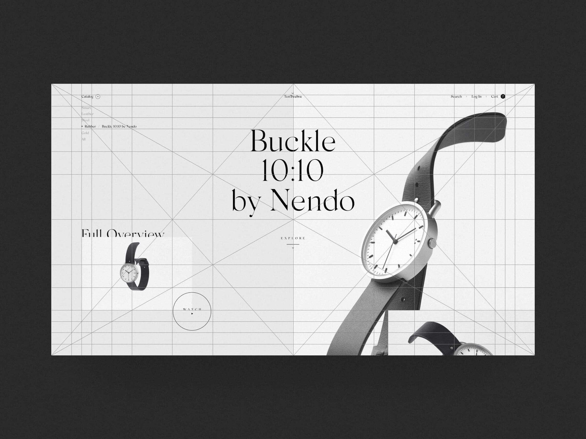
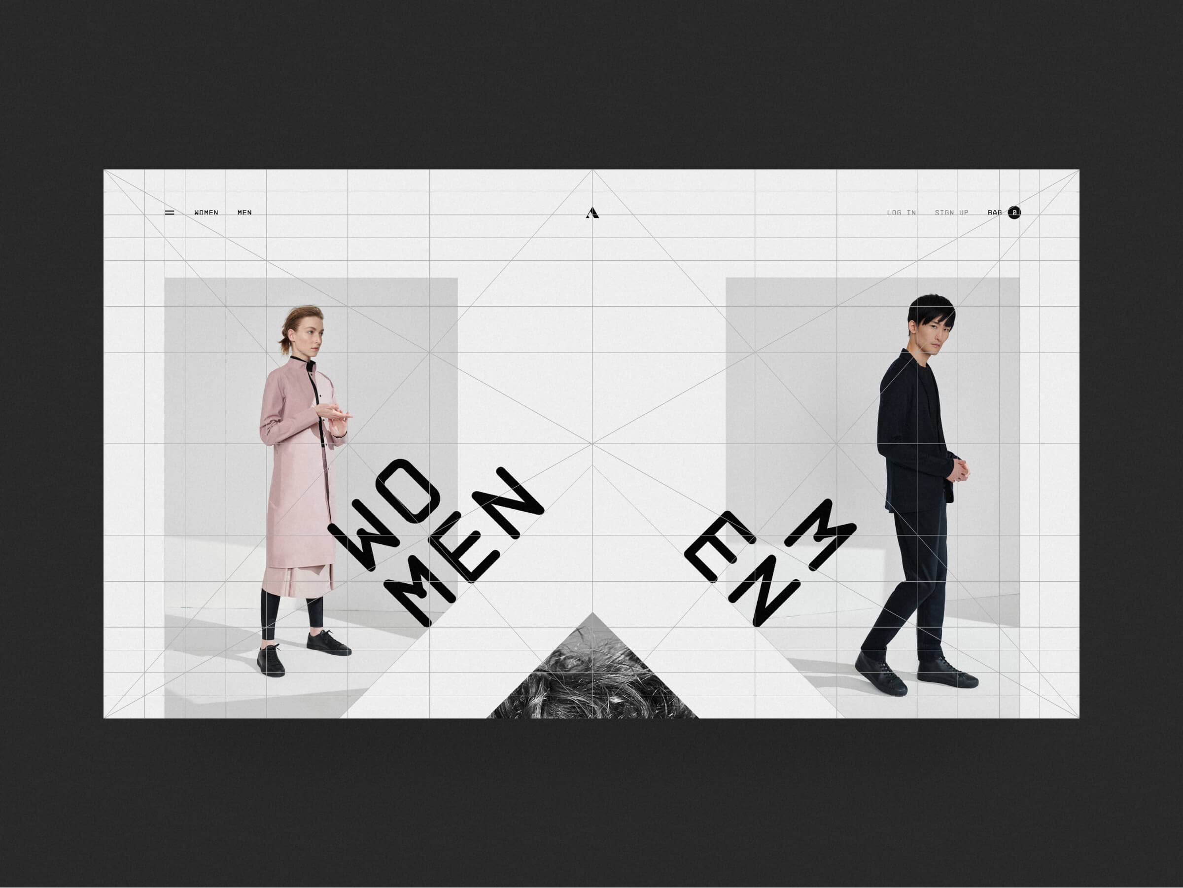
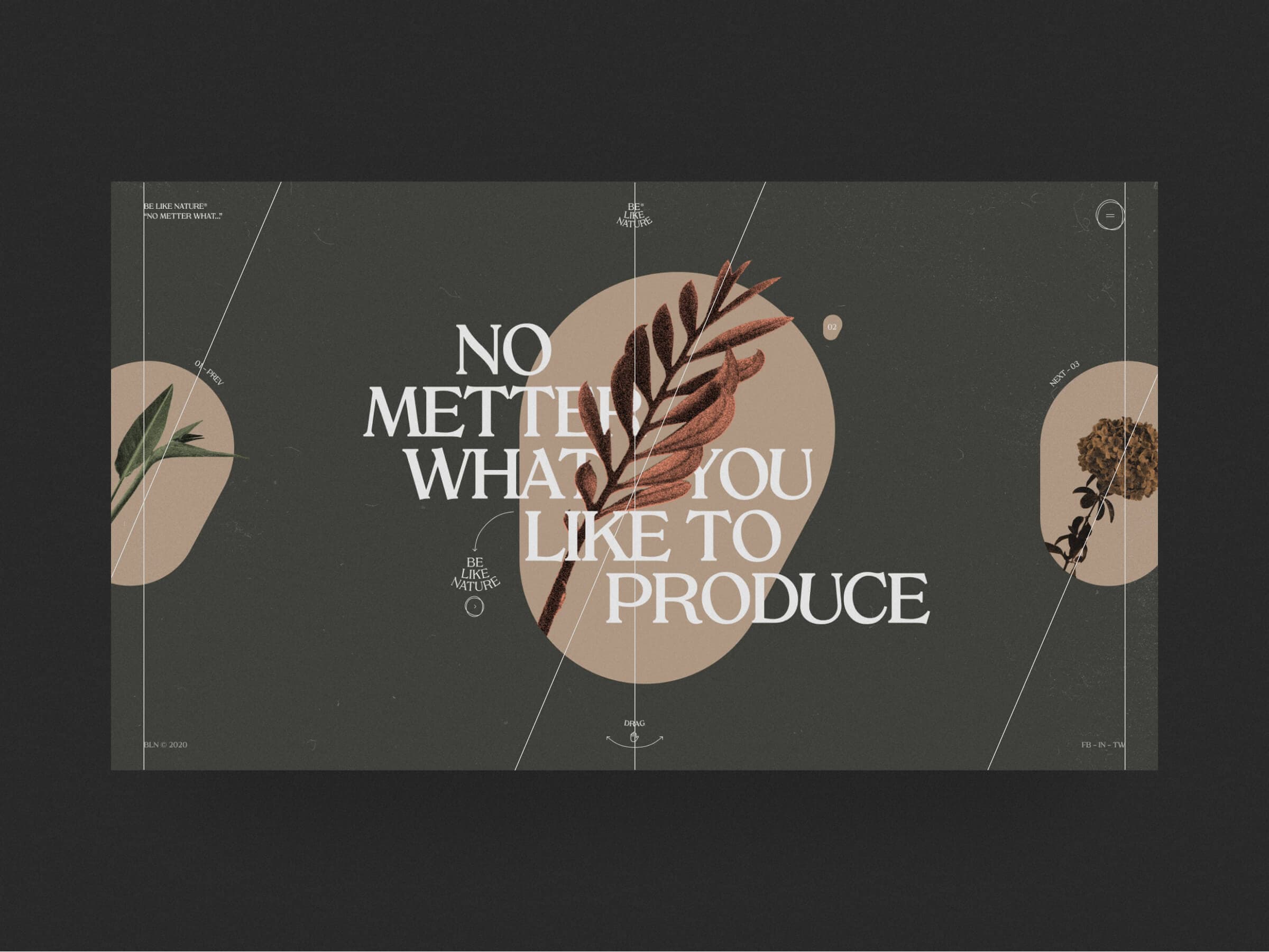
Van de Graaf Canon based grid or Golden Canon grid. This grid is based on the proportions of the carrier it is applied to. It is good for unusual designs.
(About grid)
Grid
1920 x 1080
Advices and notes
(Step 1)
Diagonals
Start from the main diagonals
(Step 2)
Main lines
Draw lines at the intersection of the diagonals
(Notes)
(1)Draw lines at the intersections until you get 40-100 margins from the edges of the screen. (2)Don't use all grid lines, select some power lines and use them. (3)This grid is very easy to adapt to other screens.

Grid
1920 x 1080
(Notes)
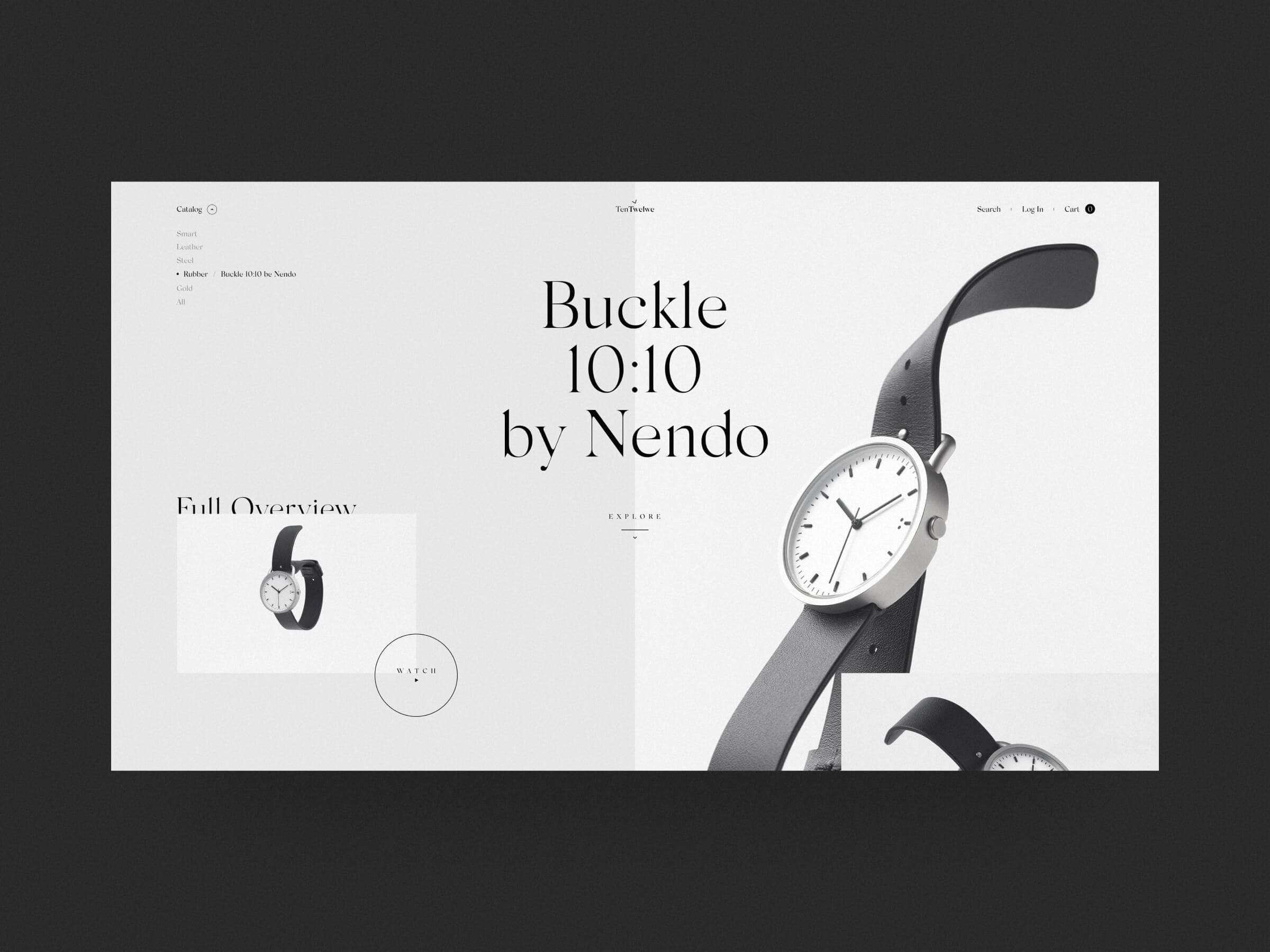
(1)Sometimes the grid itself can give you a design decision. (2)Select the power lines on which the blocks are based, they are your grid. (3)Start scaling the design only after selecting the power lines.
D






TenTwelve Obys Agency — 2019
(01)
Grid
Golden Canon
Margins
80 px
Power Lines
8
Paddings System
Used
Aeance Obys Agency — 2019
(02)
Grid
Golden Canon
Margins
80 px
Power Lines
6
Paddings System
Used
4 types of grids
4 types of grids
E
Van De Graaf
02
Columns
01
Others
04
Rectangular
03
Van De Graaf
02
Columns
01

Others
04
Rectangular
03
Intro /
Grids /
Books
Emiro ©2026
Grids
Grid:
Crazy Mode:
Intro /
Grids /
Books
Obys Agency ©2021
Grids
Grid:
Crazy Mode:
Scroll down¬
Scroll down¬
Intro /
Grids /
Books
Obys Agency ©2021
Grids
Grid:
Crazy Mode:
Intro /
Grids /
Books
Obys Agency ©2021
Grids
Grid:
Crazy Mode:
Intro /
Grids /
Books
Obys Agency ©2021
Grids
Grid:
Crazy Mode:
/ Emiro
don't
take it
too seriously
(IT'S JUST A GUIDELINE)
GRIDS Obys Agency — 2021
don't
take it
too seriously
(IT'S JUST A GUIDELINE)
GRIDS Obys Agency — 2021








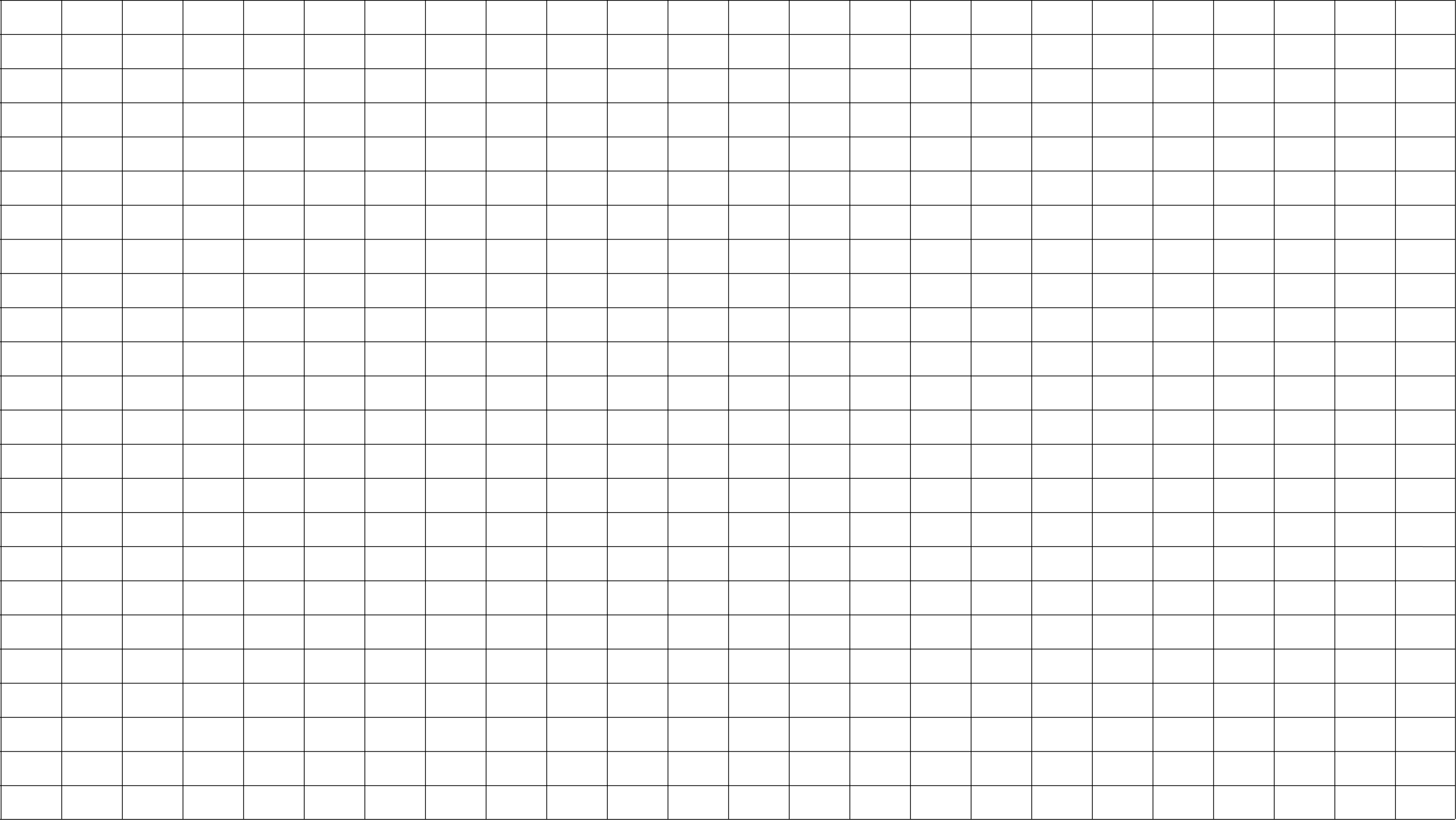
rectangular
03
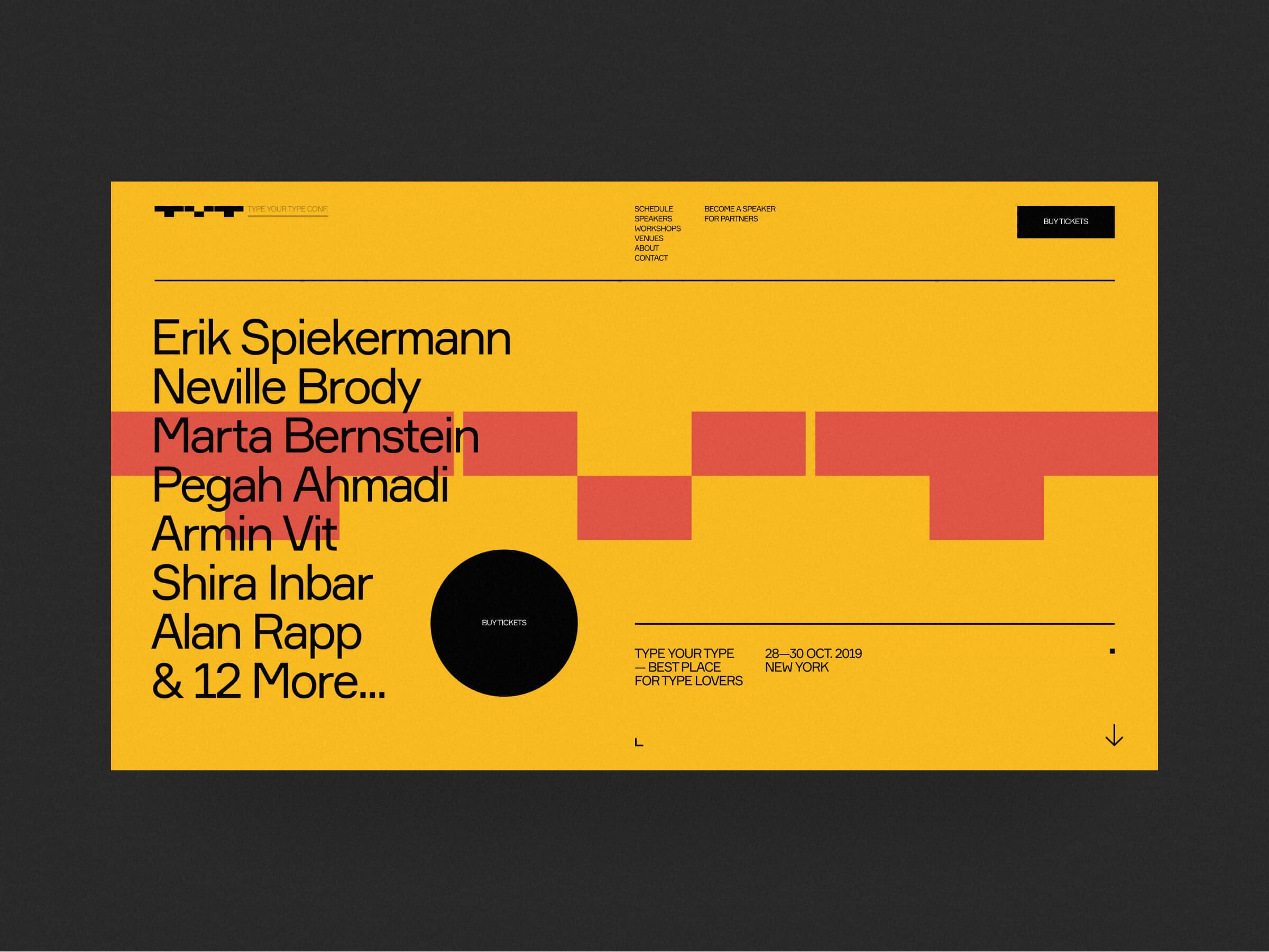
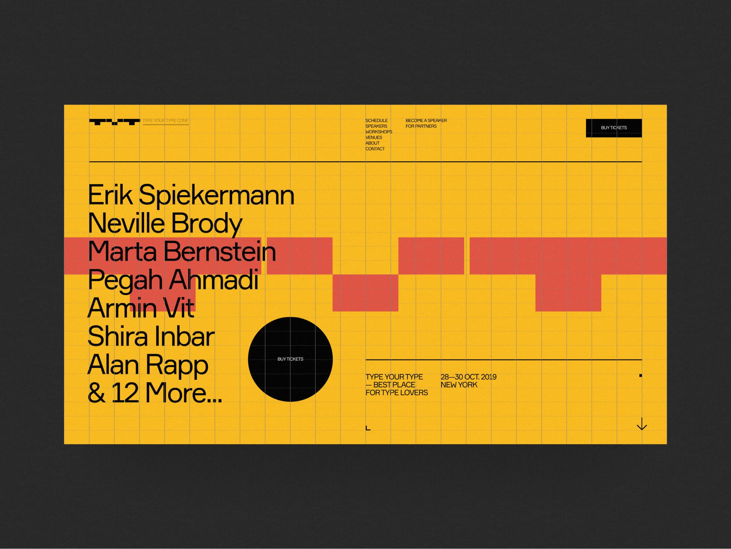
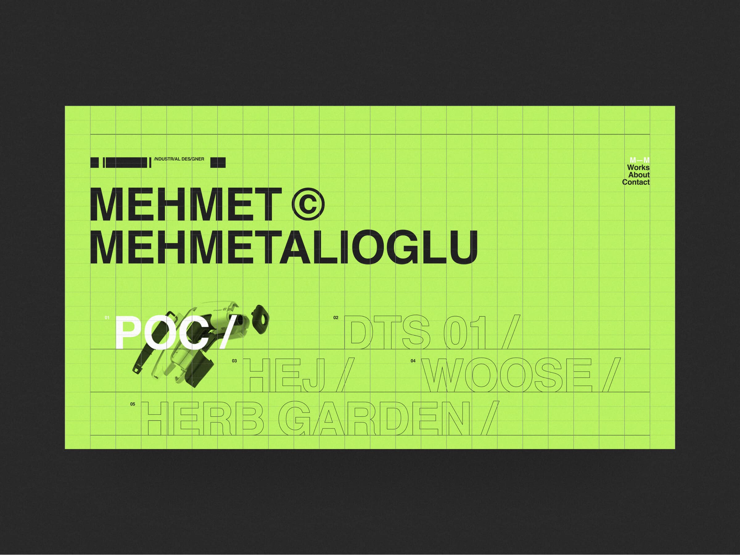
Modular or Rectangular grid. This type of the grid
is very structured and offers a very wide variety
of using. In use, it resembles the Columns grid.
(About grid)
Grid
1920 x 1080
Advices and notes
(Step 1)
Module size
Find the right module size
(Step 2)
Proportions
Use proportions similar to the screen
(Notes)
(1)The size and proportion of the module will form a horizontal and vertical grid (if there is little content, then
it is better to choose the module smaller, if there is a lot, then – bigger...). (2)Use some modules to create gutters.
Grid
1920 x 1080
(Notes)
(1)This kind of grid gives you a lot of variability and it is a pretty detailed one. (2)When using a large number of modules, highlight the main power lines.
T






others
04
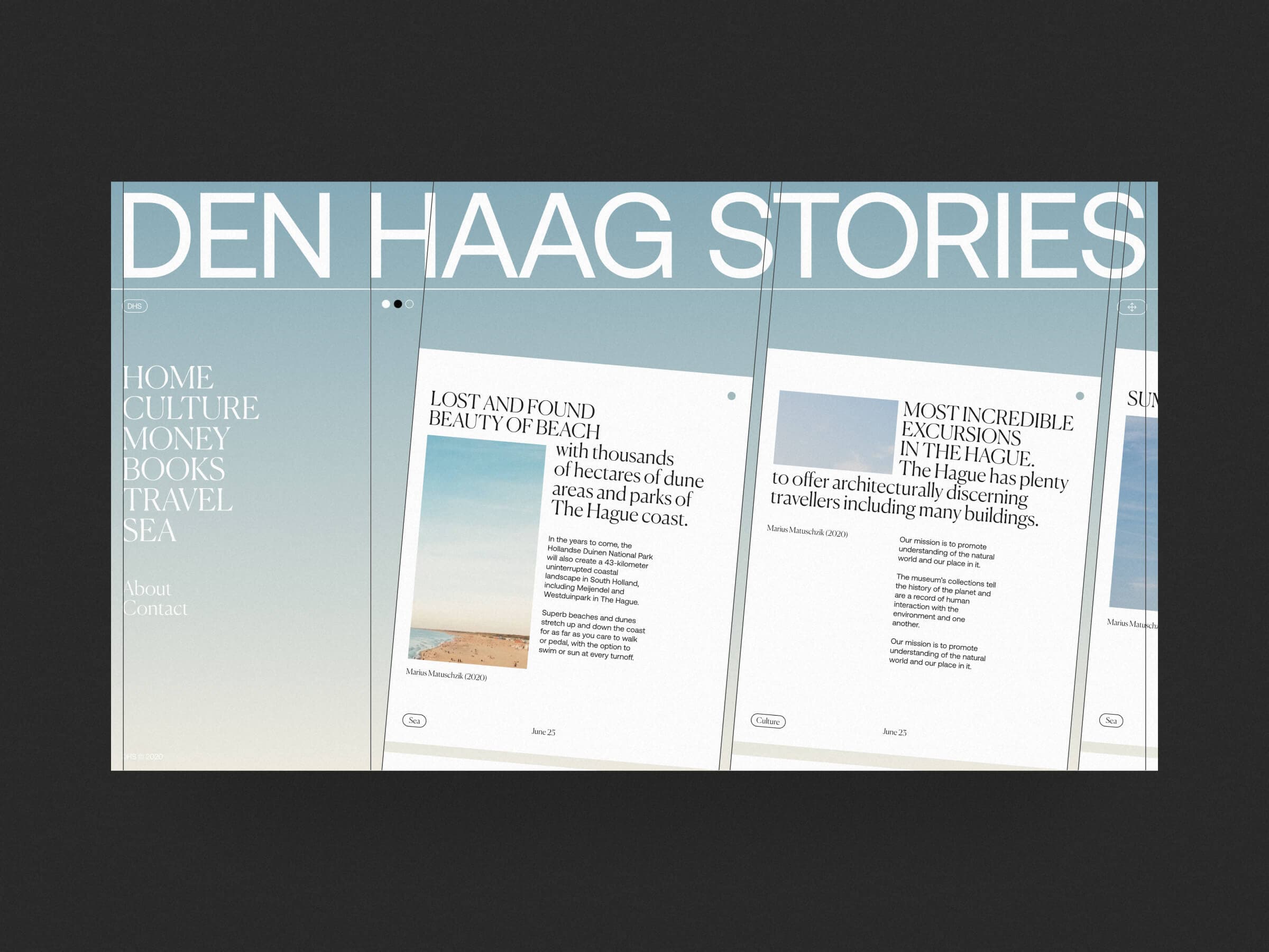
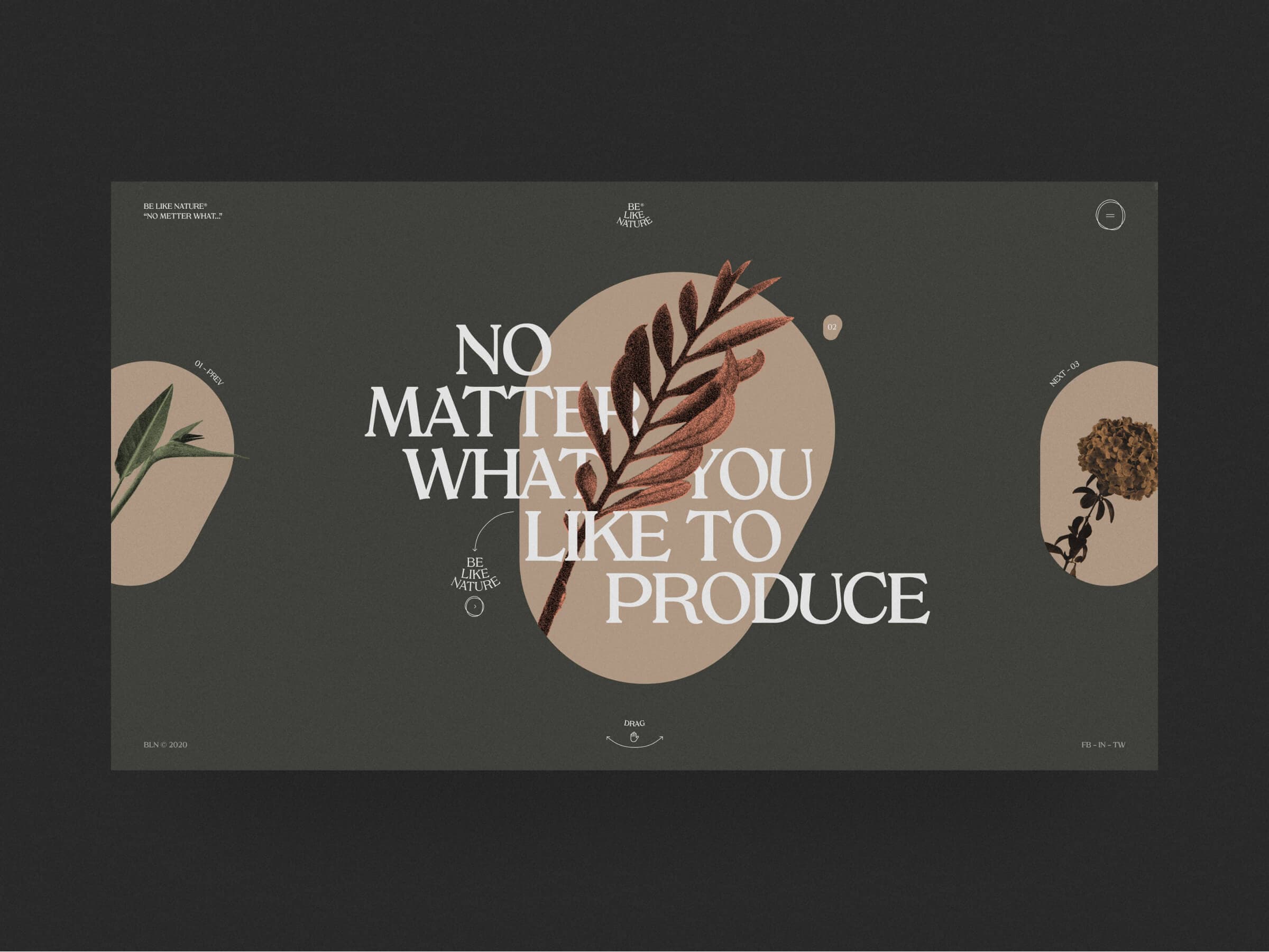
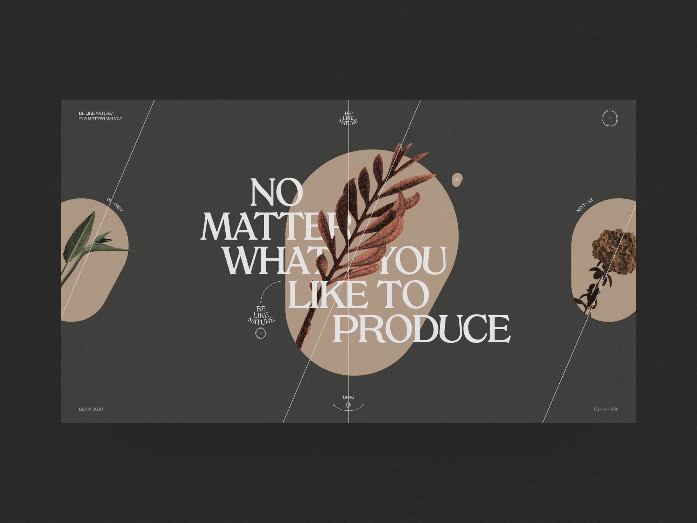
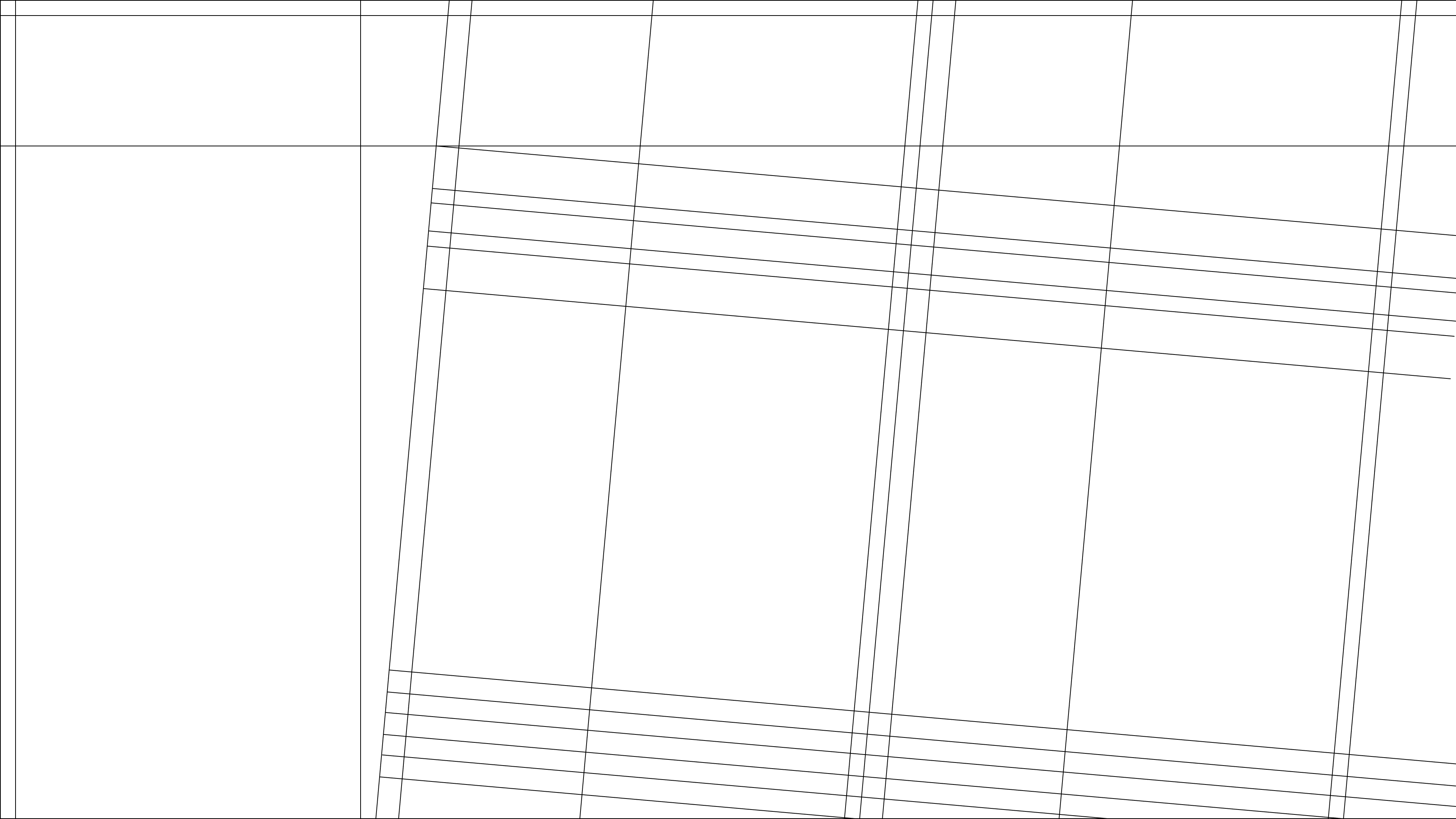
We have combined all other types of grids into this category. Grids can be asymmetric, round, diagonal... The main thing is that the grid should help to structure information.
(About grid)
Grid
1920 x 1080
Advices and notes
(Step 1)
Idea goes first
Work on an idea and don't think about a grid
(Step 2)
Think different
Don't be afraid to use non-standard grids
(Notes)
(1)Pay attention to idea and composition first, and use the grid as a tool to structure your ideas. (2)The design concept can significantly change the standard grid, on some pages it is possible to refuse the current site grid (if the concept requires it).
Grid
1920 x 1080
(Notes)
(1)Combine non-standard grids and standard ones, this will allow you to make your site creative without losing its usability. (2)A grid is just a set of rules and guidelines for posting content, don't take it too seriously.
H
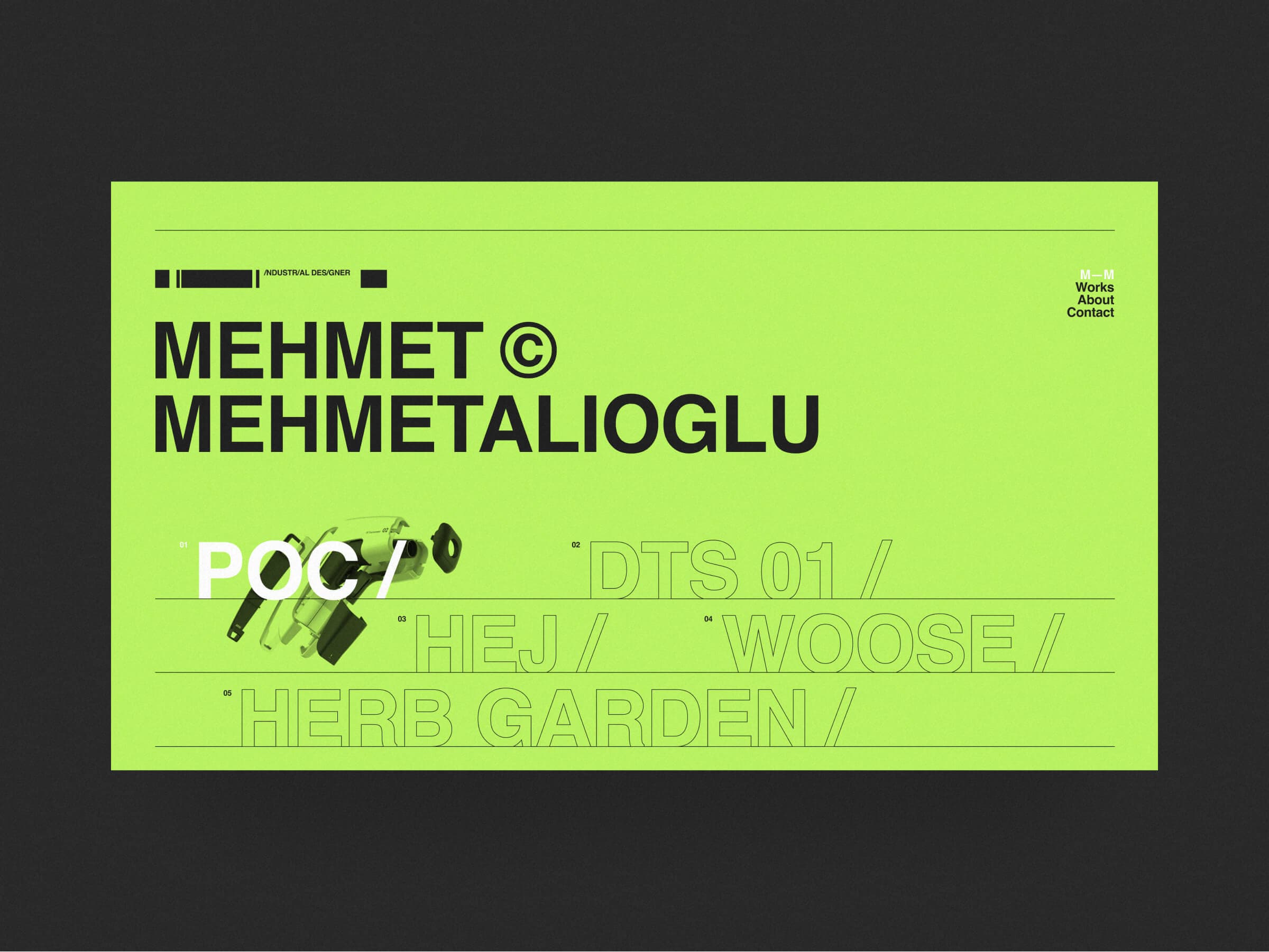
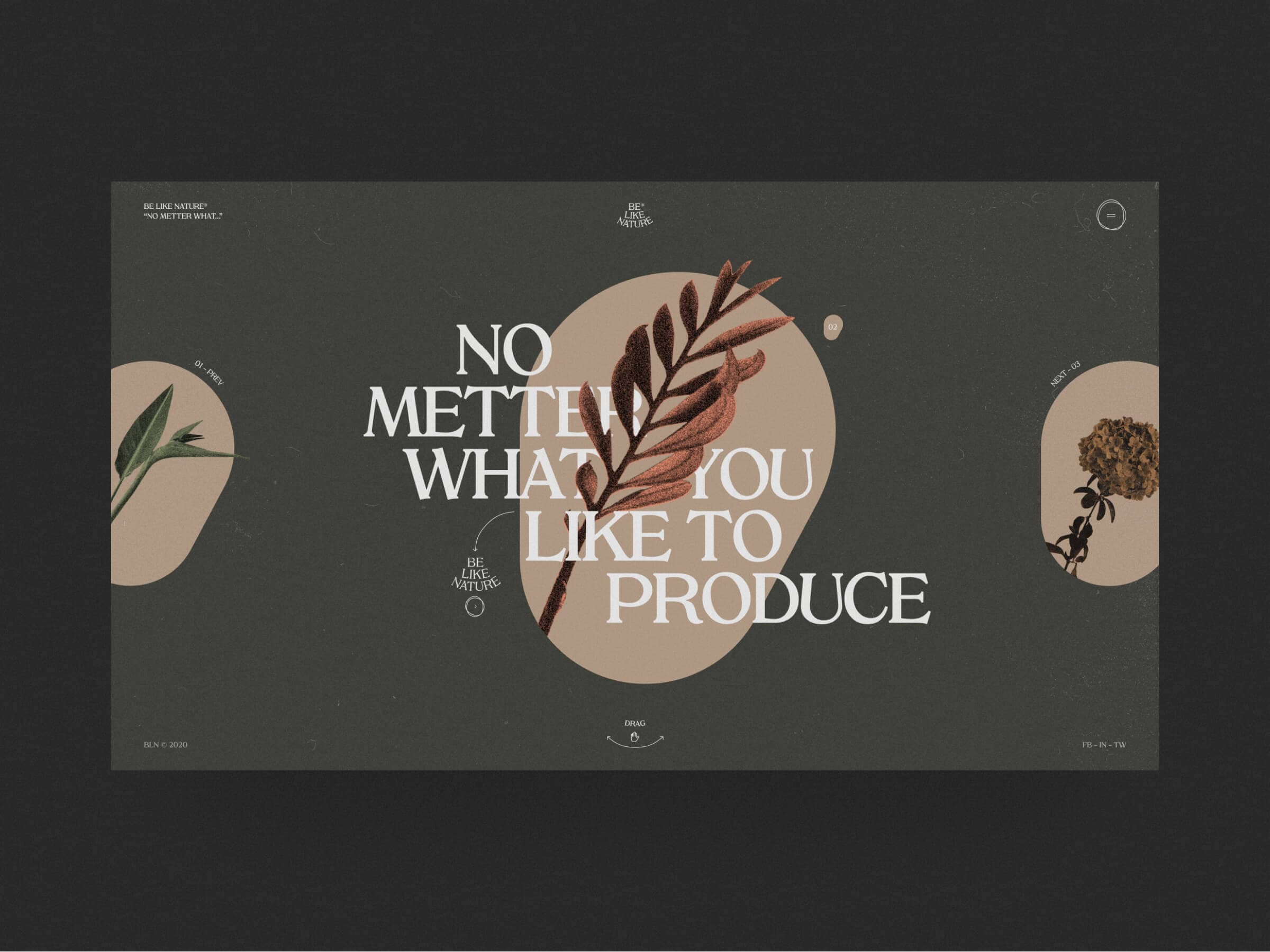
TYT Obys Agency — 2019
(01)
Grid
Rectangular
Vertical Lines
25
Horizontal Lines
25
Paddings System
Used
Mehmet Mehmetalioglu Obys Agency — 2019
(02)
Grid
Rectangular
Vertical Lines
25
Horizontal Lines
25
Paddings System
Used
TenTwelve Obys Agency — 2019
(01)
Grid
Golden Canon
Margins
80 px
Power Lines
8
Paddings System
Used
Aeance Obys Agency — 2019
(02)
Grid
Golden Canon
Margins
80 px
Power Lines
6
Paddings System
Used










GRIDS Emiro edition — 2026
Rebuilt by
Say Hi!
Original by
Built with
Next.js · GSAP · Lenis
Rebuilt from scratch by Emiro with Next.js, GSAP and Lenis —
every grid, every animation, pixel for pixel.
05 — about this edition
Emiro edition
Scroll down¬
Intro /
Grids /
Books
Emiro ©2026
Grids
Grid:
Crazy Mode:
Design
Development
E
M
I
R
O
E
M
I
R
O
Say hi —
(Say hi)
Write me ↗
GRIDS Emiro edition — 2026
Rebuilt by
Say Hi!
Original by
Built with
Next.js · GSAP · Lenis
/ Emiro